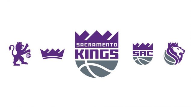
It’s official: the Sacramento Kings have a new set of logos. The primary emblem is a direct inspiration of the team’s classic old logo from the ’80s.
Refined crown & ball is modern take on civic & franchise pride that has grown for generation. #NewEraOfProud pic.twitter.com/81GT0RWvHE
— Sacramento Kings (@SacramentoKings) April 26, 2016
Here’s more info straight from the Kings:
“When the Kings moved to Sacramento in 1985, the city was transformed. Today, we aim to do it again,” said Owner and Chairman Vivek Ranadivé. “This brand kicks off a new era for our franchise as we move into the most technologically-advanced, most environmentally-friendly arena in the world. As Sacramento becomes the next great American city, this identity honors our heritage while moving us forward.”
The new primary emblem is inspired by the Kings classic logo. It is reimagined to reflect the civic and franchise pride that has lasted and grown for a generation. Now, with a clean, modern look – a reshaped crown, refined basketball and new typeface that puts Sacramento front and center – the new identity draws from the team’s ambitious beginnings and reminds our region and the world that Sacramento is undergoing a transformation.
Each of the team’s new insignia are designed to connect to the elements that define the Sacramento Kings: Our City. Our Pride. Our Foundation.
The secondary logo featuring the lion, pays tribute to the unmatched pride and loyalty of the NBA’s best fans. The “Sac” badge is dedicated to the bold and unwavering devotion the Kings organization has for its city. A new crown logo reflects the rich tradition of the team dating back to its origins, reminding the fanbase and the community of Sacramento that, “we are all Kings.” The heralding lion crest represents leadership and strength and will be used as the Kings work to make basketball the premier global sport of the 21st century.
And the official hype video to accompany the logo unveiling, narrated by none other than Vlade Divac: