The Making of the GOAT Jersey: An Oral History of the Raptors Throwback 🔥
In 1993, the NBA awarded Toronto with its first NBA franchise. Along with Vancouver, two new expansion franchises in Canada would join the League in 1995. Canadian businessman John Bitove Jr led a group of investors who became the original owners of the basketball franchise in Toronto, which was then tasked with the responsibility of coming up with a nickname and a logo for the team.
After months of research, a bit of inspiration from the movie Jurassic Park, a desire to create the Happy Meal box of uniforms, and a focus on becoming an international brand, the Toronto Raptors was born. This is the oral history of the Raptors’ infamous dinosaur logo and accompanying jersey, from its inception, to the reaction at the time from players and fans, to its lasting cultural impact.
Part 1
The Origin
Tom O’Grady (Creative Director, NBA): I was the first creative director at the NBA. When I walked into the league office, there was nobody who knew Photoshop, and I just came in and started the department. My first business card said Art Director. I had a drafting table and some tracing paper. It was exciting.
John Bitove Jr (Owner, Toronto Raptors): There was a very creative talent at the NBA office, Tom O’Grady, who was a really fantastic guy to collaborate with. We had worked together on the 1994 FIBA World Championship logo, so there was a trust.
O’Grady: Early on, everyone assumed they were going to be named the Huskies, because of the Toronto basketball team that was there in 1946.
Bitove Jr: I was going to call it the Huskies. But I talked to people at the League, and they said, “We already have the Minnesota Timberwolves. You might want to try something new.” I was like, You guys are right.
O’Grady: John was a younger guy, and while he didn’t frown on Canadian pride, he told me, “The last thing I want is a maple leaf with a basketball. I want this to be an international brand.”
Bitove Jr: We wanted something that was global and something different that would stand out in the Canadian landscape. That’s how we ended up with purple as our dominant color. It wasn’t being used anywhere in Canada at the time.
Himal Mathew (Consultant, Toronto Raptors): We were looking for something contemporary, youthful, energetic and with an appeal that would be much wider than the traditional hockey culture at the time.
Isiah Thomas (Part Owner and Executive Vice President, Toronto Raptors): John and I felt focusing on the youth and capturing the next generation was the most important thing. We spent a lot of time studying Disney and McDonald’s. When you look at someone like Mickey Mouse, we wanted something that would basically stand the test of time.
O’Grady: He saw what McDonald’s had with the happy meal. Kids would walk in for a crappy hamburger and apple juice, and their eyes would light up because of the Happy Meal box. John wanted the Happy Meal box of uniforms. He wanted kids to be attached to it. I remember Bitove Jr asked me what my experience was with other teams in professional sports that had been named after dinosaurs. I know more about sports logos than I should, and I couldn’t think of any team. He asked if I thought there was an opportunity there, especially with the popularity of Jurassic Park.
Bitove Jr: My personal preference was T-Rex. I thought Toronto T-Rex had a good ring to it. But people said the T-Rex was slow and lumbered around, where the Raptor was faster, and it just seemed to identify more with what you wanted a basketball player to be. Hockey is the old, established white man sport in Canada. The only way we were going to grow the sport was focusing on the youth, women and new Canadians. We did a focus group on the final 10 names (Beavers, Bobcats, Dragons, Grizzlies, Hogs, Raptors, Scorpions, T-Rex, Tarantulas, Terriers) and people got the most excited about the Raptors name.
Mathew: Almost every individual pundit had their own favorite name, which they argued for passionately. Similarly, there were names that people didn’t like and took great pleasure in mocking. The name “Raptors” came as a surprise to me and I think to many. I thought it was creative, original and strategically right on target.
O’Grady: We designed a few versions of the Raptor and I faxed some stuff to him.
Bitove Jr: It was awesome. It hit everything that we wanted. It was global. It was different. It was animal-like.
O’Grady: The original uniforms were pretty simple. We had the Raptors font on top of a logo, a circle and a number underneath it. John was like, I want more, this is not enough. The marching order was let’s do something that’s over the top with the uniforms. We did one with the claw marks on the pinstripes. And he said, we need one more thing.
Bitove Jr: I told Tom, why don’t we throw the full logo on the jersey? He sent it back to me and was like, this thing is really standing out. I said, Good, that’s what we want.
O’Grady: He ran home. He went crazy. His kids loved it. Restraint was never a desire. We really let it rip. It was really fun. It was a great chance as a designer to get in there and do something that pretty much no one had ever seen before.
Bitove Jr: We had a lime green version [pictured below]. We had gold as the color instead of silver. We had various different versions.
![]()
O’Grady: The red didn’t pop in until later. John started having conversations with some of the other owners, and they mentioned there was nothing that spoke to Canada here. I remember he called and said he wanted to change the Raptor to red instead of green.
Bitove Jr: The lime green Raptor was a very close second. At the end of the day, we had to have some red because we’re in Canada, so I said fine, we’ll put the Canadian red in there so there’s some Canadian in it.
O’Grady: When we started putting together the purple, the red and put it together with the black, it started to look really badass. It was tough looking.
Thomas: Purple was my favorite color, and our colors became very popular. The city and the fans embraced it.
Part 2
The Reaction
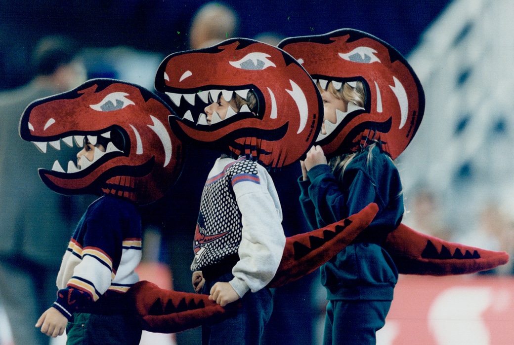
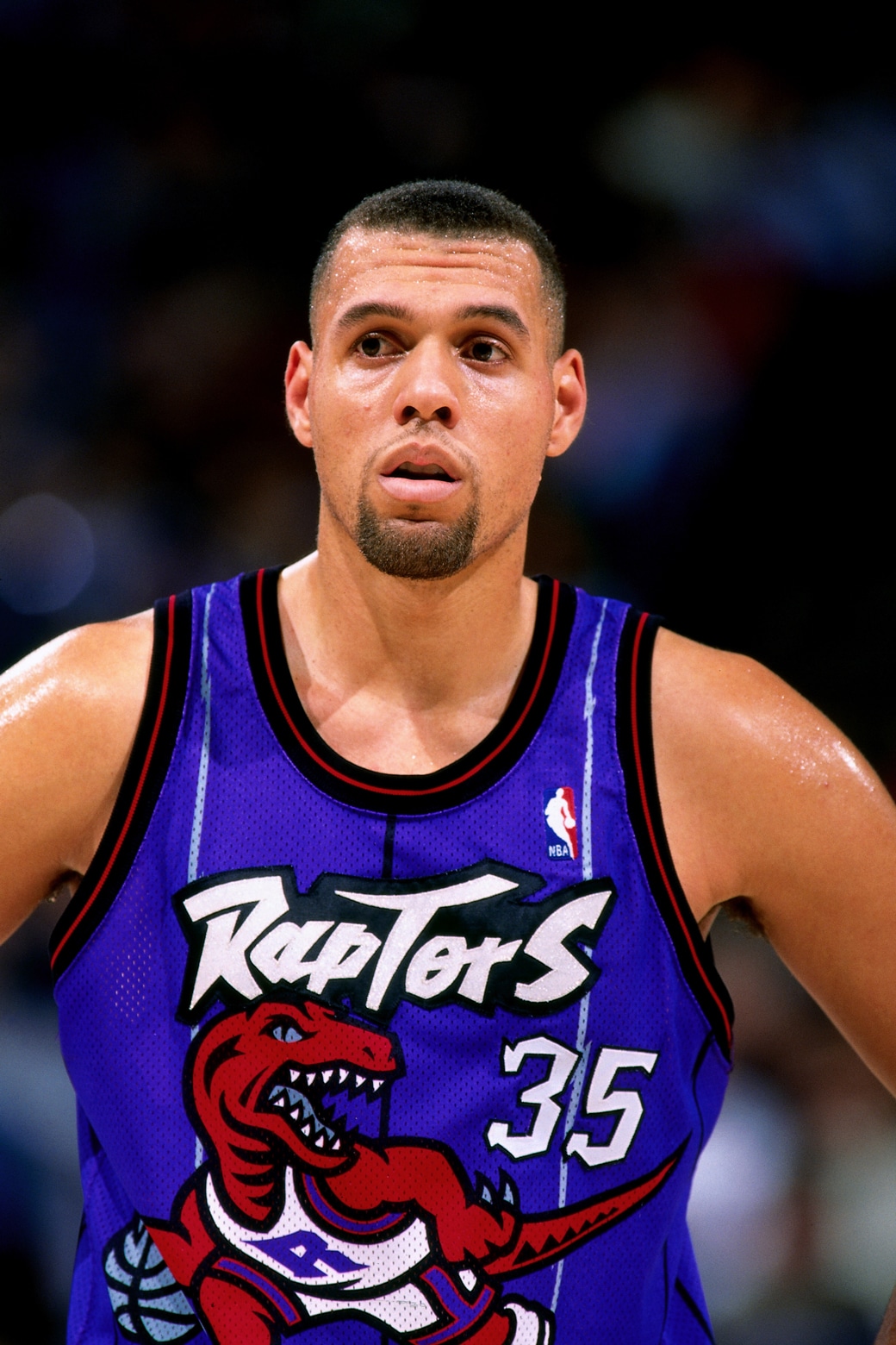
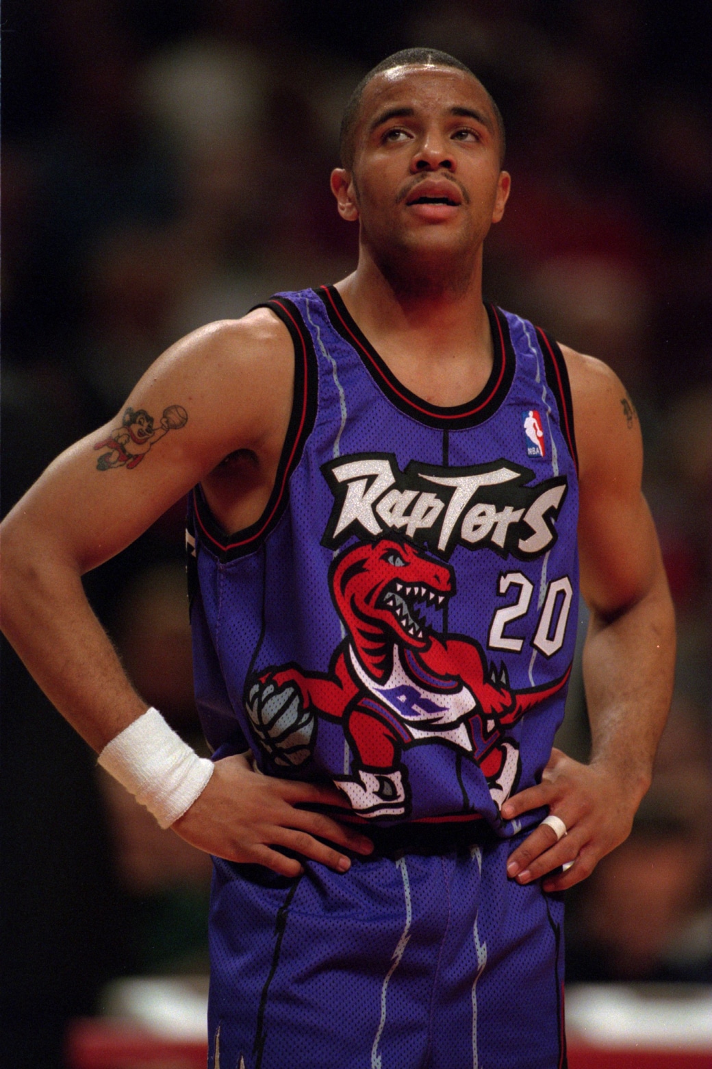
The team’s logo was officially unveiled in 1994. The official colors were red, purple, black and “Naismith silver,” in honor of James Naismith, the Canadian who invented basketball in 1891. Even if not everyone fell in love with the logo, they could all agree on one thing: it was different.
Joshua Roter (Co-owner, In Vintage We Trust): The Raptors took an amazing risk and giant leaps in terms of branding. It didn’t look like anything that existed in pro sports. It really personified that specific era.
O’Grady: The traditionalists hate it. It’s not classic, it’s not the Celtics or Lakers—well, no shit. The younger kids love it because it’s so different and so fresh and it’s so anti-traditional sports design.
Paul Lukas (Journalist, Uni Watch): In the earlier eras, cartoon animals in sports logos were Bugs Bunny characters. They were fun loving and a little mischievous. The Raptor looked ferocious and intimidating. Although it was also so over the top, there was a camp element to it.
Roter: Graphically, looking at the logo, it’s really well done. The teeth, the shoes with the toes coming out are fire. There’s a lot to love about it.
J.E. Skeets (TV Personality, NBA TV’s The Starters): The logo is gigantic—that’s another hilarious part, not only is it a Raptor dribbling, which is hilarious, it’s just gigantic. It takes up the entire jersey. And then you throw in those weird pinstripes. There’s a lot going on.
Tracy Murray (Player, Toronto Raptors 1995-96): I loved the colors. The original colors, man. Purple, black and white. I loved it.
Skeets: On the one hand, it didn’t matter because I was such a huge basketball fan, so it was like, who cares, Toronto is getting a basketball team. And then it was like, what are they called? What was that thing? What does that have to do with Toronto and Canada?
Thomas: Jurassic Park was very popular, and the Raptor just fit what we wanted to be. It had ferocity and intelligence, and the Raptor was known for its intellect and one of the smartest dinosaurs. It fit what we were trying to impart into our team.
Murray: It was based on a pack of smaller carnivore dinosaurs that operates as one. I thought it was appropriate for us. We played extremely hard and we played as one.
Roter: If you look up the dictionary of what a sports logo looked like in 1995, the Raptors logo would be there. The era was louder and much more stylized than it is now.
Damon Stoudamire (Player, Toronto Raptors, 1995-98): I thought it looked like Barney at first.
Murray: It was Barney with teeth.
Bitove Jr: That was a complete coincidence. We knew people were going to say that, but we didn’t want to give up on the color purple. We established the color purple before we established the logo.
Jerome Williams (Player, Toronto Raptors, 2001-03): It didn’t remind me of Barney, because the Raptor was always mean and aggressive.
O’Grady: I always thought what we did was badass and different. If you see the Jurassic Park logo, it’s got this extinct dinosaur. I thought no one would ever call that guy Barney. I understand people react because of the purple, but it wasn’t a purple dinosaur—it was red, and he had some character to him.
Murray: We used to make jokes about that, and jokes were flying from opposing players all the time about it.
Stoudamire: I knew people were making fun of them, but no one said anything directly to me.
Murray: You could make jokes, but we would come at you like a pack of Raptors.
Stoudamire: It grew on me. It became synonymous with who we were.
Part 3
Cultural Impact
As Bitove Jr predicted, the Raptors were a bad basketball team for their first few years in the League. But everything changed when Vince Carter ended up with the franchise in 1998.
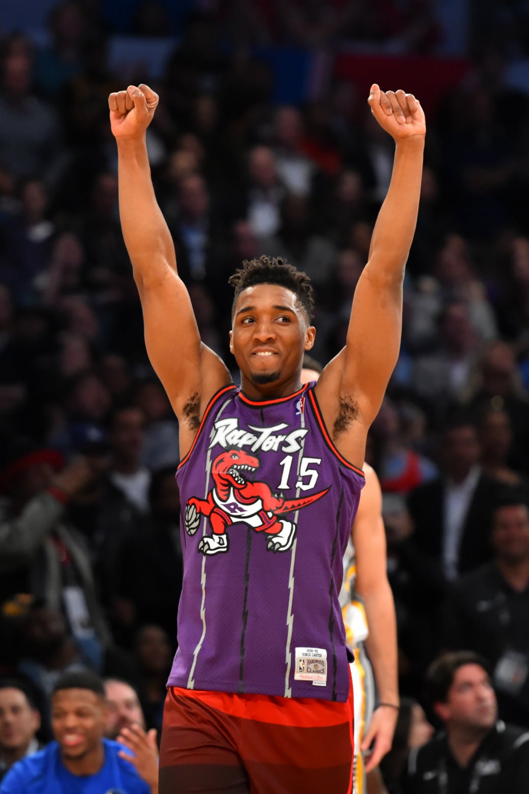
By the time he captured the attention of basketball fans worldwide at the 2000 Slam Dunk Contest, the Raptors were wearing a different jersey design, albeit one that was still purple.
At last year’s Slam Dunk Contest, when Donovan Mitchell paid homage to Carter by wearing his jersey, it was a Mitchell & Ness throwback of Carter’s rookie season, the famed dinosaur logo jersey. (As opposed to the actual, much-less-cool jersey VC wore in the ’00 Dunk Contest.) Over two decades later, the original Raptors logo/jersey combo continues to make a pop culture impact as one of the most popular and fun-to-wear throwbacks in existence.
O’Grady: A lot of people have fond memories of the logo today.
Roter: I definitely miss the purple. The best memories of being a Raptors fan is the Vince Carter era.
Lynn Bloom (Director, Authentics and Archives, Mitchell & Ness): In 2017, the Vince Carter 1998-99 season jersey was our fifth best selling authentic jersey. The authentic Raptors shorts were fifth and the Swingman shorts were seventh. The Raptors warm-up jacket was our sixth best selling outerwear piece. The Raptors are definitely one of our top-selling teams.
Skeets: I think the part of Vince Carter wearing that colorway when he’s in the Dunk Contest and getting on SportsCenter every night, that’s a big part of it. Vince Carter is forever going to be known as one of the coolest basketball players we ever saw.
Bloom: I think it’s a true appreciation of the uniqueness of the logo, design and colors. And Vince Carter.
Bitove Jr: Everyone remembers Vince Carter’s Slam Dunk Contest and remembers him doing it in the dinosaur jersey—but he didn’t. That speaks to the strength of the dinosaur jersey.
Roter: We have a lineup of people at the door at our store ready to buy whatever dinosaur piece we have. It doesn’t matter if it’s a hat, a jersey, a t-shirt, a jacket. I could drop a floor-length parka with a dinosaur logo in July and someone would buy it. It’s definitely the most sought-after sports logo in the store.
Stoudamire: In hindsight, the dinosaur design was ahead of its time.
Kaylem Mullings (16-year-old Toronto-area High School Basketball Player): I have noticed its popularity coming back. I think that it’s a really cool outfit and the design has a higher artistic value compared to the other throwback jerseys.
Kevin Ngure (17-year-old Toronto-area High School Basketball Player): My favorite part of the original logo would have to be the purple. It just stands out. Purple isn’t really common with NBA teams so it makes it unique.
Lukas: Nostalgia is one of the strongest forces in sports. People really embrace memory and history. Things that were once lambasted as horrible and the worst design ever and an embarrassment, give it enough time, and suddenly it becomes nostalgically endearing.
Bitove Jr: There’s pride that we created something and achieved what we wanted.
O’Grady: It’s been fun to see it have a second life. The logo has such a polarizing identity. You either love it or hate it. It’s one of those rare birds.
—
Alex Wong is a writer for theScore. Follow him on Twitter @steven_lebron.
Photos via Getty Images. Logos via NBA.