NBA logos can trigger religious devotion or provoke strong rejection. They can also stand for something that has nothing to do with their actual aesthetics. From a design standpoint, sports logos need to survive on a variety of surfaces—timber, plastic, foam, ice, grass—and they need to be visible at extreme sizes. In certain instances, as Vice Sports’ Andrew Helsel notes, “Logos have nothing to do with performance” but “plenty to do with performance goals.”
Todd Radom, who has been crafting event and team logos for a quarter century as the Creative Director of his eponymous design company, says, “Design for sports teams is different from design for any other consumer brand because sports fans are the most ardent, passionate brand loyalists on earth.” He adds, “There are untold billions of dollars attached to revenue directly derived from team identities.”
In the NBA, identity includes primary, secondary and tertiary logos; the home, road and alternate uniform systems; and the actual court design. From Mitchell & Ness throwbacks to New Era snapbacks, there are a number of tangents that link back to the respective team identities. That places extra importance on team branding. Every footwear brand draws inspiration from a franchise’s visual identity because sneakers, especially PEs, can act as extensions of the uniform, thus apparel color and team logo matter. Athletes might not always wear matching kicks, but footwear manufacturers make sure they’re available. As Radom notes, identities “need to successfully extend to a larger program.”
Christopher Arena, the NBA’s Senior Vice President of Identity, Outfitting & Equipment, tells us that all relevant parties “work toward a common goal to deliver the team an identity that represents its goals and objectives.” The NBA advises where need be, but identity creation is essentially left up to the team.
When the Golden State Warriors elected to revisit their 1969 The City emblem, they didn’t just re-energize consumers, their logo ushered in an orbicular renaissance. Now the Atlanta Hawks, Milwaukee Bucks, Philadelphia 76ers, Toronto Raptors and Washington Wizards have all reintroduced themselves with ring-shaped logos while 2015’s other identity reviser, the Los Angeles Clippers, unveiled a botched facelift when the world was expecting a sexy, rejuvenated makeover.
Yet of all the new emblems to surface during Adam Silver’s epoch, the Bucks’ reboot is by far the most elegant. New team owners Wesley Edens and Marc Lasry brought with them a revised branding and marketing strategy, one that would require a complete makeover.
Designed by Doubleday & Cartwright, a Brooklyn-based, creative agency that was founded by three friends—Aaron Amaro, Christopher Isenberg and Kimou Meyer—the new identity also enlisted the skills of Justin Kay, a D&C Creative Director who just so happened to be a lifelong Bucks fan from Milwaukee.
Having previously designed campaigns for Nike, including a range of work centered around Kobe Bryant, LeBron James, Carmelo Anthony and Chris Paul, the D&C team was perfectly suited to the task, but because of their unproven track record, “the Bucks had to convince League officials that their choice wouldn’t backfire,” Meyer admits. “We felt like we had to prove ourselves.” But at their initial presentation, League officials were impressed.
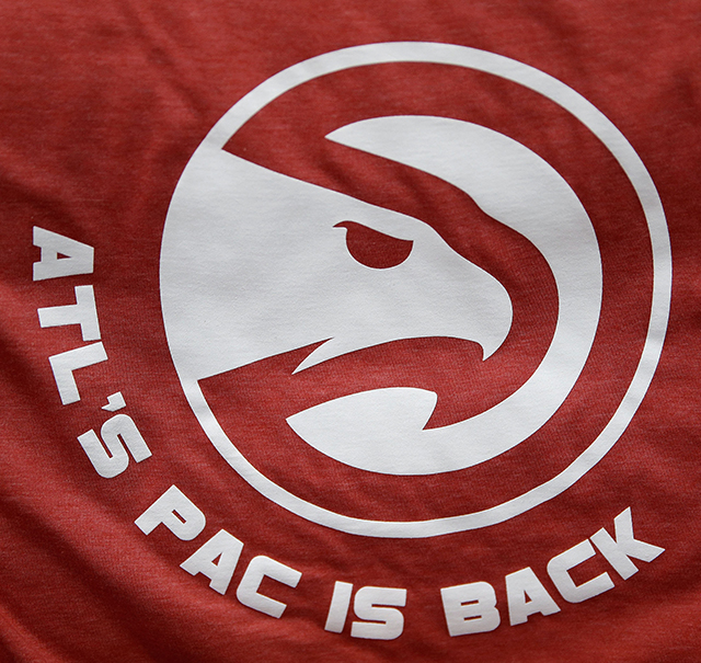
Elsewhere, teams are certainly rolling the dice. Washington made their W-shaped icon disappear but oddly kept the sorcerer tag. Their logo is now all about the Capital’s monument, but their appellation is at odds with their branding. The decision makers for the Raptors believe that claw marks and a sans-serif font are enough to get their message across, while Philadelphia has elevated its Benjamin Franklin logo and taken its uniforms back to the days of Dr. J. Atlanta, meanwhile, reissued the Pac-Man and are now a “Basketball Club,” but those items pale in comparison to the three modish, fluorescent green-accented uniforms they’ve assured viewers won’t blind them during HD broadcasts. Yet the talk of new identity town always circles back to Milwaukee, who, according to UniWatch’s Paul Lukas, are “definitely in the top 10” when it comes to their new uniform system.
After the D&C team solved their primary logo puzzle (Meyer says the deer head was built like Frankenstein’s monster), they developed the team’s home, away, alternate and pride (t-shirt) uniforms. “There’s a huge difference between designing for print or web versus designing for garments,” Meyer says, “but because the team already knew how to create t-shirts and jersey patches, we were well equipped to produce the Bucks’ uniforms.”
When it comes to NBA design, there really are only two constants: 1. Not all athletic club identities are created equal, and 2, logos rarely last forever. There have been, by our count, 81 different primary logos since the NBA-ABA merger (and we arrived at that figure after discounting color upgrades, basic shape modifications or minor typeface refinement). That translates to roughly three facelifts per franchise…or a reset every 14 years. So hang in there, Clipper Nation.
top image by Tom Medvedich