Style Corner: 2012 Cavs Alternate Unis
by Sandy Dover / @San_Dova
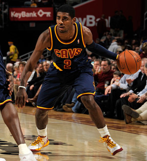
The Cleveland Cavaliers recently debuted their newest addition to their in-game garb, an alternate uniform (or third jerseys, as they’re sometimes called) which makes use of the Cavs’ three main colors (outside of white)—navy blue, old gold, and wine (red). Though navy became a part of the Cavs’ color palette in 2003, the change over to a new look in 2010 made blue a background color, as the organization chose to make the classic wine and gold combination of the 1970s the favored duo of Cleveland’s pro basketball identity. Thankfully, the blue is back, for a few reasons.
One big reason that I think the navy is great to re-introduce is because it’s a handsome color. It’s stately, it’s modern, and it hard to mess up (the problem today, though, is that many other NBA teams love to make use ofnavy, and have basically played the color out as an alternate look — See: Nuggets, Denver; Hawks, Atlanta, etc.). Navy also links to the recent past, and that past was winning, despite any hard feelings about LeBron James. The blue is easy on the eyes and makes the accents of the uniform pop, which as a byproduct enhances Cleveland’s look, taking it from that boring and drab ‘70s look (which is laborious to stare at when the team wears the primary wine/gold sets) to a look that has dimension with its triad of accent hues.
(The classic cut of the uniform is great, too. Many of today’s NBA teams employ V-neck collars and the pinhole Rev30 adidas mesh—these particular sets use a closed hole mesh for better color richness and the more traditional scoopneck collar, giving the alternate uniform a subtle retro style. Even better? No Rev30 numbers—just the standard tackle twill appliqué, which jettisons the tacky look of the new numbers that are adhered to the new Rev30 league uniforms.)
Sadly, though, I’m not in agreement with everything about these new uniforms. For one, the numerals on the jersey have a Comic Sans look with the gold trim, which hasn’t been the best of script choices for Cleveland in the media; the numbers look a bit cartoony. Secondly, the navy/gold/wine combination is really color-rich, which appears somewhat forced and contrived, effectively making the players look awkward with the big, thick goldwaistbands and such. Thirdly, like the other unis in the Cavs’ uniform roster, the “CAVS” script lacks character and is very basic in a computer clip art-kind of way, and the gold trim only highlights that; however, the flipside to all of the negatives of the uniform is that they recall the simple style of the Cavs’ early-‘90s look, which itself succeeded in a basic aesthetic.
Sandy Dover is a published author, fitness & media professional, and a SLAM web columnist & print contributor whose work has been featured and published by US News, Yahoo!, Robert Atwan’s “America Now” and ESPN. You can find Sandy frequently here at SLAMonline and via his website at About.Me/SandyDover, where he can also be contacted.