Peter Moore had come up with an idea to “break the color barrier in footwear.” He decided to make a shoe that was primarily black and red, just about unheard of for basketball sneakers. That wasn’t enough, though. He still wanted another element to differentiate the Air Jordan I, one detail that nobody had ever seen before.
A light went off for him.
“[Nike Vice President] Rob Strasser and I are coming back from having a meeting with [Michael Jordan’s agent] David Falk,” Moore remembers. “We have decided that we’re gonna go after the kid. We’ve also decided, per David Falk’s suggestion, that we’ll call it ‘Air Jordan.’
“On the flight home I start thinking about what this logo would be,” he continues. “I’m walking into the plane and I see this little kid and he’s got this set of captain wings on his shirt. They’re plastic. The flight attendant had just given it to him. So I said, ‘Can I have a pair of those wings?’ The lady looked at me like I was some kind of a jerk, but she gave me the wings and I sat down and started drawing the wings. I put a basketball in the middle of them. This was all being done on a cocktail napkin while Rob and I are flying home. That became the logo.”
Moore, during a phone call more than 30 years since that moment, chuckles a little bit.
“It’s a very simple story,” he says. “Most people think these things are complicated. They’re really quite simple.”
Even if it only took him a couple of minutes, the Wings logo was Moore’s defining contribution to the Air Jordan line.
“Historically, it represents flight,” David Creech, current VP of Design at Jordan Brand, says about the logo. “It was part of the magic of MJ and obviously the AJI.”
Translating it from a cocktail napkin to the Air Jordan I happened quickly, in an effort to impress Jordan and to put the line into production.
“We’re telling him how he’s going to be the most important player in the game, how he’s got his own logo, how no one’s ever done anything like this before,” Moore says in his portfolio, a book released in 1995 that contains his work and the story of his career.
In fact, the entire Air Jordan I project was rushed. They finally got Jordan under contract right before his rookie season started, and in order to have the shoe ready for him to play in, Moore had to work overtime for months. His ability to produce with such speed had been honed over the course of nearly a decade.
He had been working as a freelance graphic designer in 1976 when he got a call from the advertising manager of Nike. He began to work on a project-to-project basis for the young company. He eventually met Strasser, Nike’s Marketing Director at the time. After their first sit-down, Moore was put on a monthly retainer, making posters and helping to cultivate the brand’s image, which he says was nonexistent at the time.
Before the success of the I, Moore was known for his work with those posters. He was the mind behind the Swoosh’s famous conceptual visuals, imagining athletes in different worlds, like the Moses Malone poster where he’s holding a staff. The posters did so well that he was eventually promoted, becoming Nike’s first Creative Director.
Most of the early work at Nike was done at that fast pace. Moore says things were often “chaotic and frantic, with short deadlines and no clear direction.”
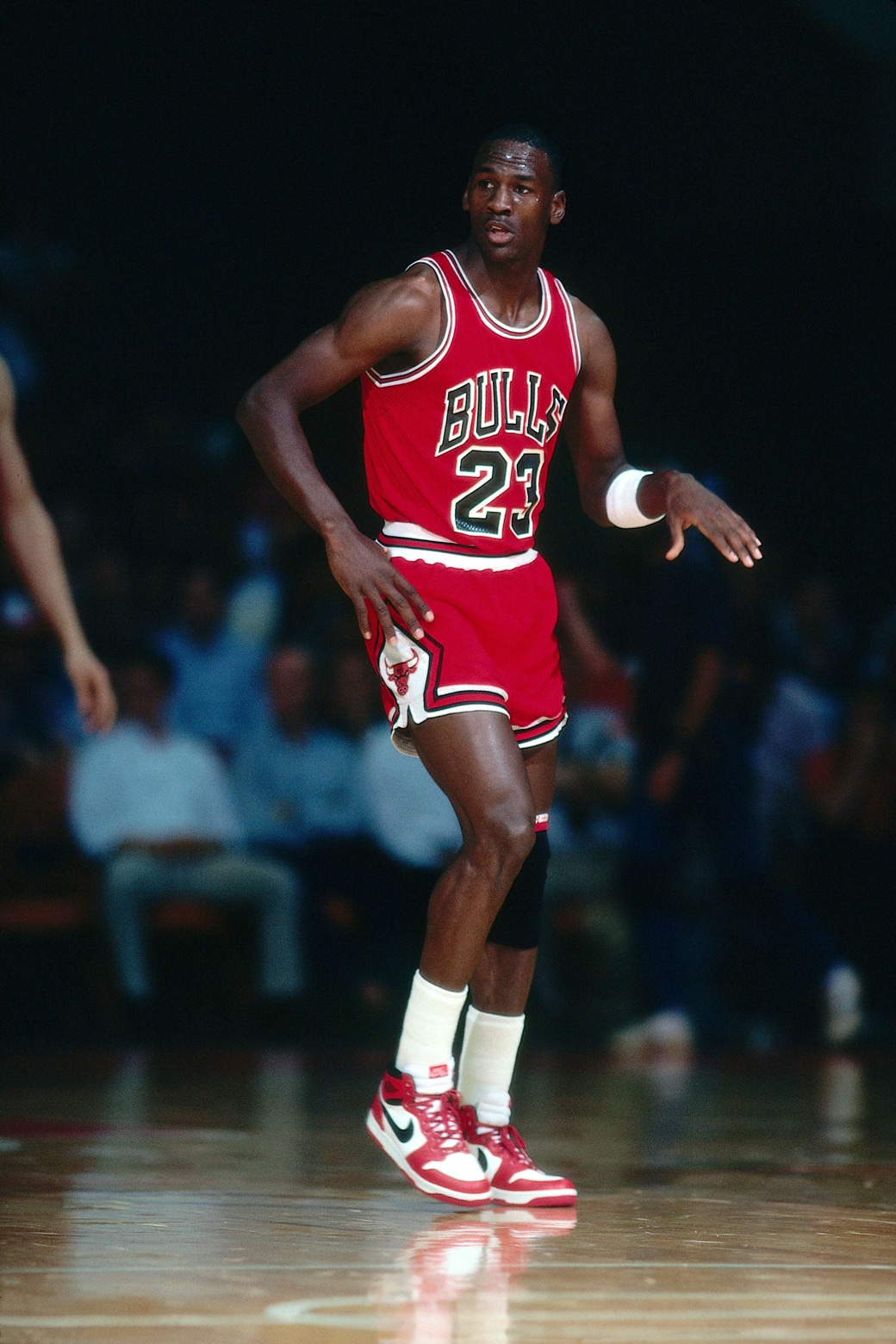
The direction rapidly became clearer as Michael came on board. It was all about creating the future of sneakers for the future of the NBA. Everything about the Air Jordan I was brand new—the colors, the cut and especially the idea of a personal logo. Moore applied the logo to shirts, tank tops and sweatpants.
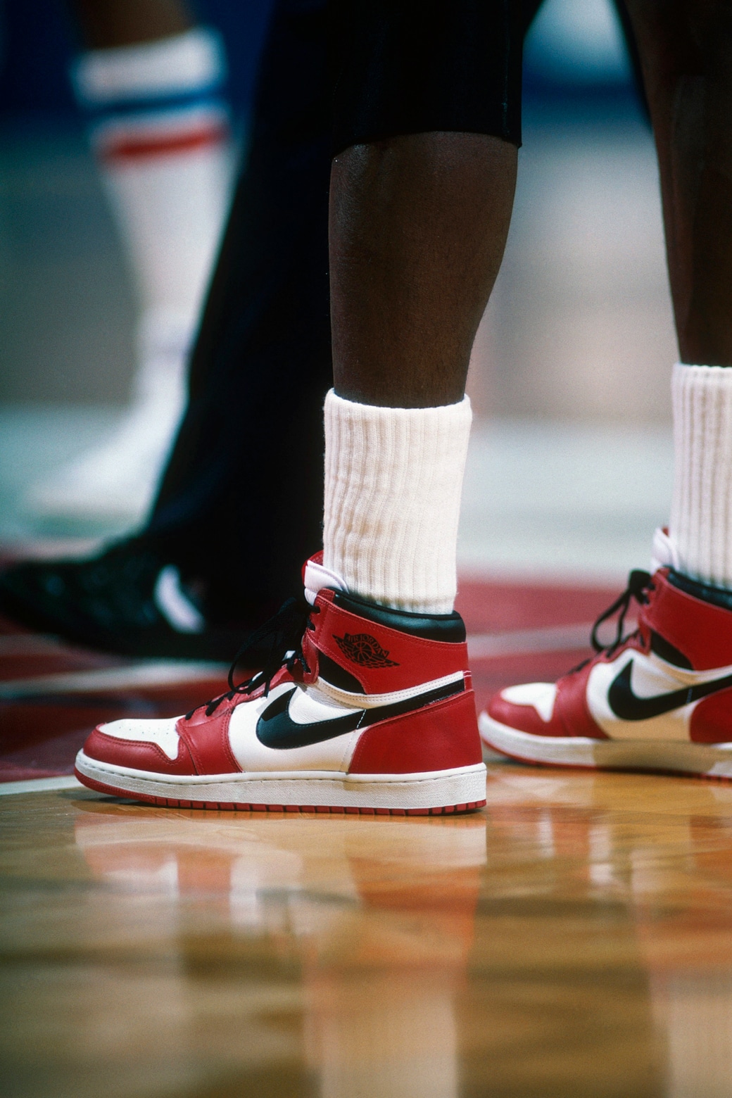
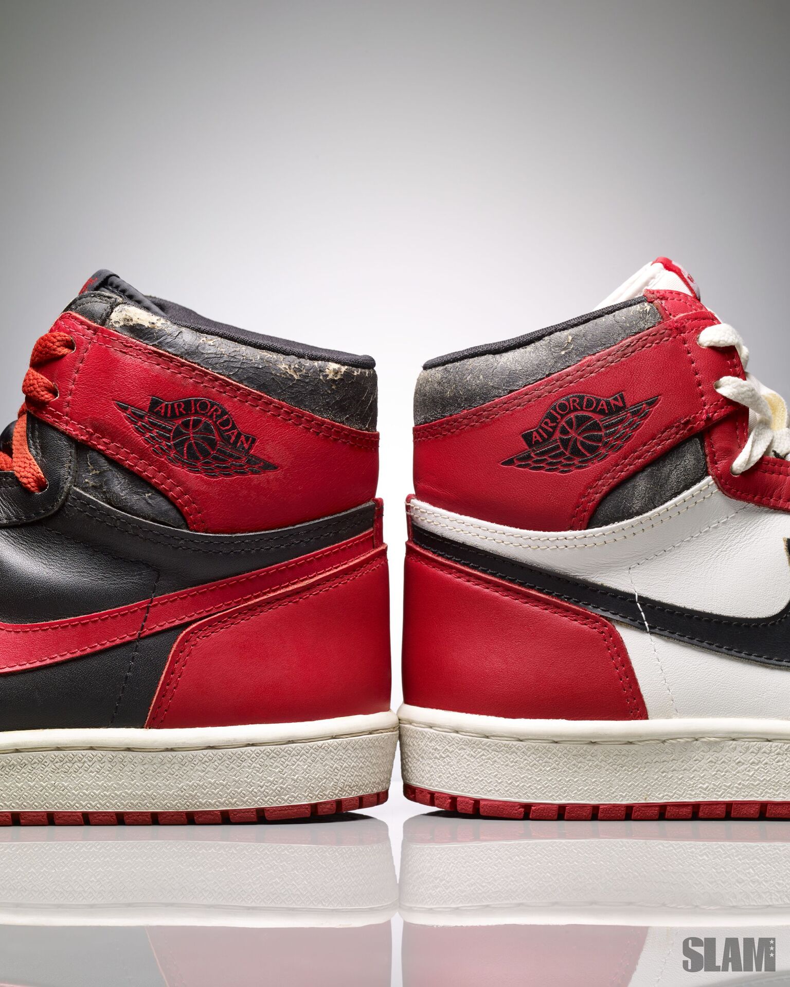
The finishing touch came on the collar of the Air Jordan I. The logo was put on the lateral side, where it was impossible to miss. It’s the image that represents the trip that Jordan was about to embark on. He was on a spaceship to the moon, with a basketball in his hands and the Air Jordan I on his feet.
The Wings logo would also make it onto the Air Jordan II. The luxury silhouette didn’t get much run back in the day, due in large part to Michael’s foot injury in his sophomore season. But the logo sat there, real nice and big on the tongue.
Once the Air Jordan III dropped, the Wings were taken off the line in favor of the Jumpman. The logo wasn’t included in the Air Jordan line for years. It was finally brought back on the XXXII, marking a return to the first official Air Jordan logo.
It was the missing piece for Moore, the declaration.
Watch me make history. Hop on the flight or get out the way.
—
Max Resetar is an Associate Editor at SLAM. Follow him on Twitter and Instagram.
Photos via Joseph Sherman, Greg Neumaier and Getty Images.